Hi Steven !
You have 5 new messages

You have 5 new messages

June 16, 2025 · 10 min read

Designing for a SaaS product is a unique challenge. Unlike a marketing website — where the goal is to make a strong first impression and prompt an action — a SaaS interface is something users return to daily, weekly, or even hourly. They are trying to do real work with it. And the design needs to support that work without getting in the way.
The stakes are also different. In a SaaS context, a confusing or frustrating interface does not just cost you a potential sale — it costs you an existing customer. Churn in SaaS is expensive because it undermines the subscription model that makes SaaS businesses valuable. Every user who cancels is not just lost revenue — they are a signal that something in your product is not working well enough.
The businesses that build lasting SaaS products — the ones with low churn, high NPS scores, and passionate user bases — almost always share one thing: they take UI design as seriously as they take engineering and sales.
The first time a user logs into your SaaS product is one of the most critical moments in their entire lifecycle with you. They have just signed up — they are curious, they have some motivation, and they are willing to invest a few minutes in learning. But that window is short.
If within those first few minutes the user cannot figure out where to start, what the product does for them, or how to achieve the first meaningful outcome — they will mentally disengage. They may not cancel immediately, but their activity will drop, they will stop logging in, and eventually they will let the subscription lapse.
Good SaaS onboarding UI design addresses this by:

One of the most difficult design tensions in SaaS is the gap between new users and experienced users. New users need guidance, simplicity, and clear pathways. Power users — the ones who use your product for hours each day — need speed, density, keyboard shortcuts, and advanced features they can access without wading through menus.
The best SaaS interfaces handle this through progressive disclosure and adaptive complexity. The simple, guided view is what new users see first. But as users demonstrate familiarity — through usage patterns, time on platform, or explicit preference settings — the interface can gradually reveal more advanced capabilities.
This approach keeps the product approachable for beginners while being genuinely powerful for experts, without making either group feel like the product was built for someone else.

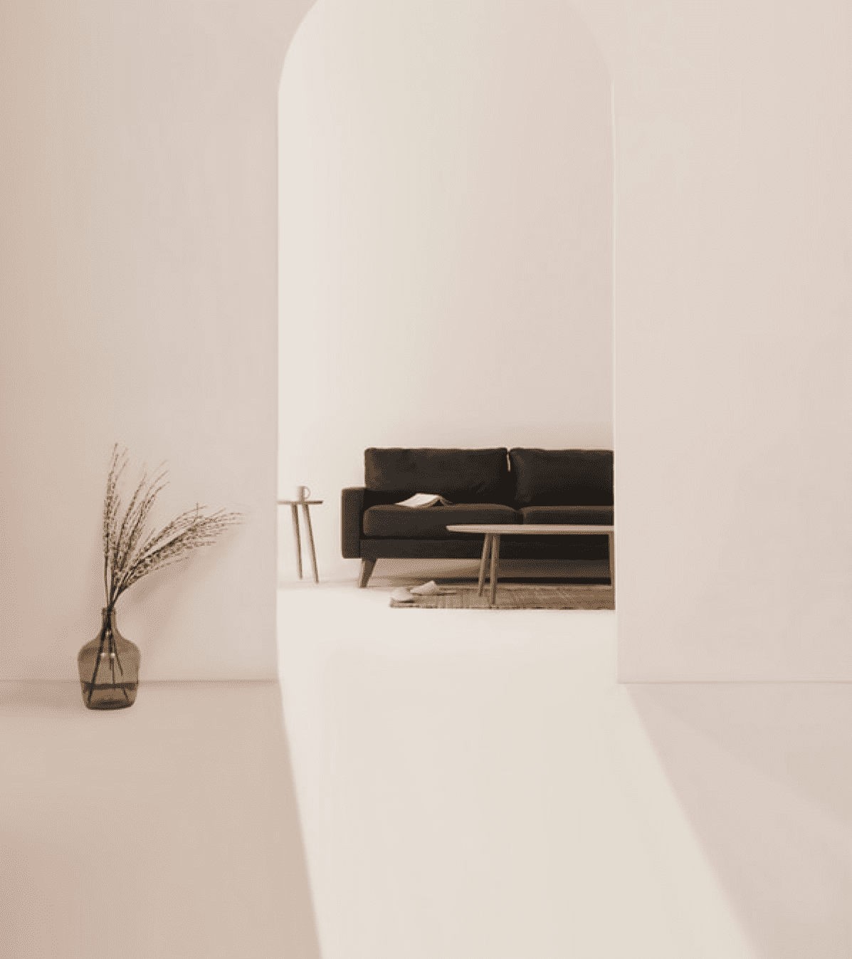
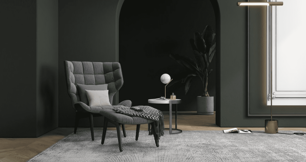
Most SaaS products include dashboards — screens that show users the status of something, trends over time, or key metrics they care about. Dashboard design is one of the areas where UI design has the biggest immediate impact on perceived value.
A well-designed dashboard tells a story. It surfaces the numbers that matter most in a format that is immediately understandable, shows trends in a way that prompts action, and gives users confidence that they understand what is happening in their business or project. A poorly designed dashboard is just a collection of widgets — numbers and charts that require effort to interpret and often get ignored.
Key principles for effective SaaS dashboard design:
The SaaS market in India is growing at a remarkable pace, with Indian-founded SaaS companies increasingly serving global clients. For these companies, UI design needs to meet international standards — clean, professional, and competitive with products from the US and Europe. At the same time, products built for the domestic Indian market need to consider language diversity, different currency and date formats, and user expectations shaped by local market leaders like Zoho, Freshworks, and OYO.
In the UK, B2B SaaS buyers are sophisticated and data-driven. They evaluate tools carefully before committing, and trial periods are where your UI either wins or loses the deal. A polished, easy-to-use trial experience is as important as any feature list in the sales process.

We have worked on SaaS products across a range of industries — project management, HR tech, fintech, e-commerce tools, and more. Our process always begins with deep understanding of the users and their workflows. We map out the full user journey, identify friction points in existing products, and design interfaces that make users feel capable and confident.
We build design systems that scale — consistent components and patterns that your development team can implement efficiently and that give your product a coherent, professional feel at every touchpoint. And we stay involved through development to make sure what gets built matches what was designed.
If you are building or redesigning a SaaS product, we would love to talk about how great UI design can accelerate your growth. Get in touch with the Artwefx team today.